Overview
IT admins use Box's User Management tool to manage Box accounts for their employees — adding people and configuring their permissions and settings. Over 6 years the tool had grown outdated and no longer supported admins' needs: at scale, pages took up to 60 seconds to load, and years of accreted features had made everyday journeys convoluted.
I was responsible for understanding the current pain points and reimagining the experience to improve both performance and usability — a ground-up redesign of the tool's information architecture, interaction model, and visual design.
What's Box?
Box provides cloud content-management solutions that let customers securely store, manage, and share content with people inside and outside their organization.
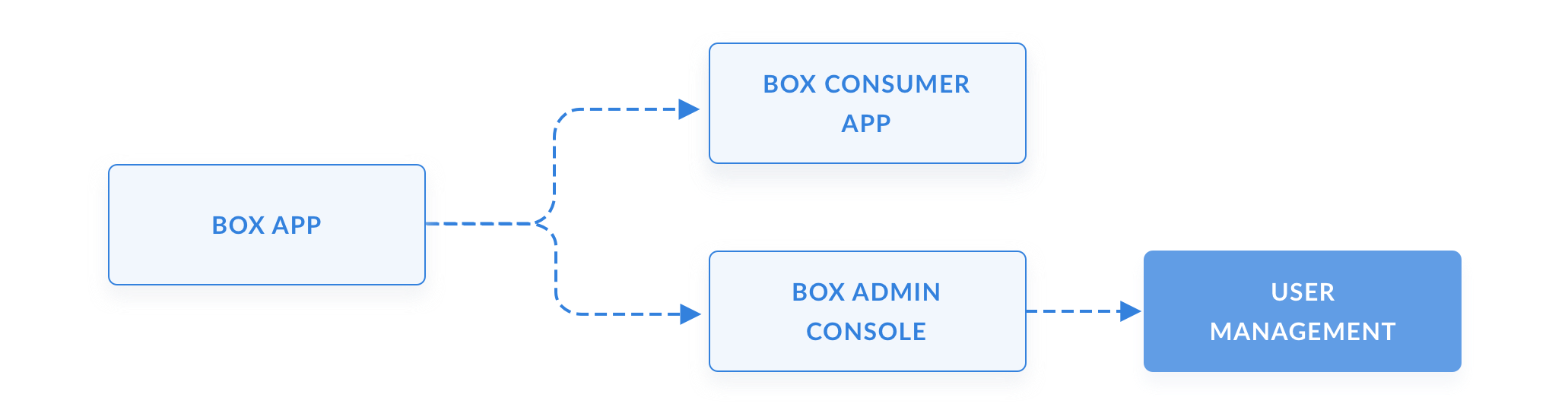
Box has two main facets: the consumer app, which people use to store and manage their files, and the Admin Console, which gives IT admins comprehensive controls to add, edit, and remove users, configure the right settings and permissions, and run audit reports. Along with two other designers, I own the design of the Admin Console — and here I led the redesign of its User Management tool.
The User Management tool is the primary place for admins to add, edit, remove, and set up users with the right permissions and features across the company.
When software feels archaic
The tool was built 6 years ago, with features constantly bolted on and band-aid fixes layered over time. The number of issues and the tech debt had reached a critical mass — so we decided both the backend architecture and the user experience needed a complete overhaul.
Scale
As our customers grew, User Management failed to scale with them. For the top ~10% of our largest customers the experience had become near-unusable — pages took 10–60 seconds to load.
Usability
As features piled up, journeys grew convoluted. In Q3 2019, 29% (94 of 321) of admin tickets were "how-to" questions about features that already existed — but were unusable or undiscoverable.
"The slowness of the Admin Console materially impacts our use of Box and prevents us from being able to work through our day to day."
"The admin tools look like they're from the 90s… it's not intuitive."
Mapping the personas
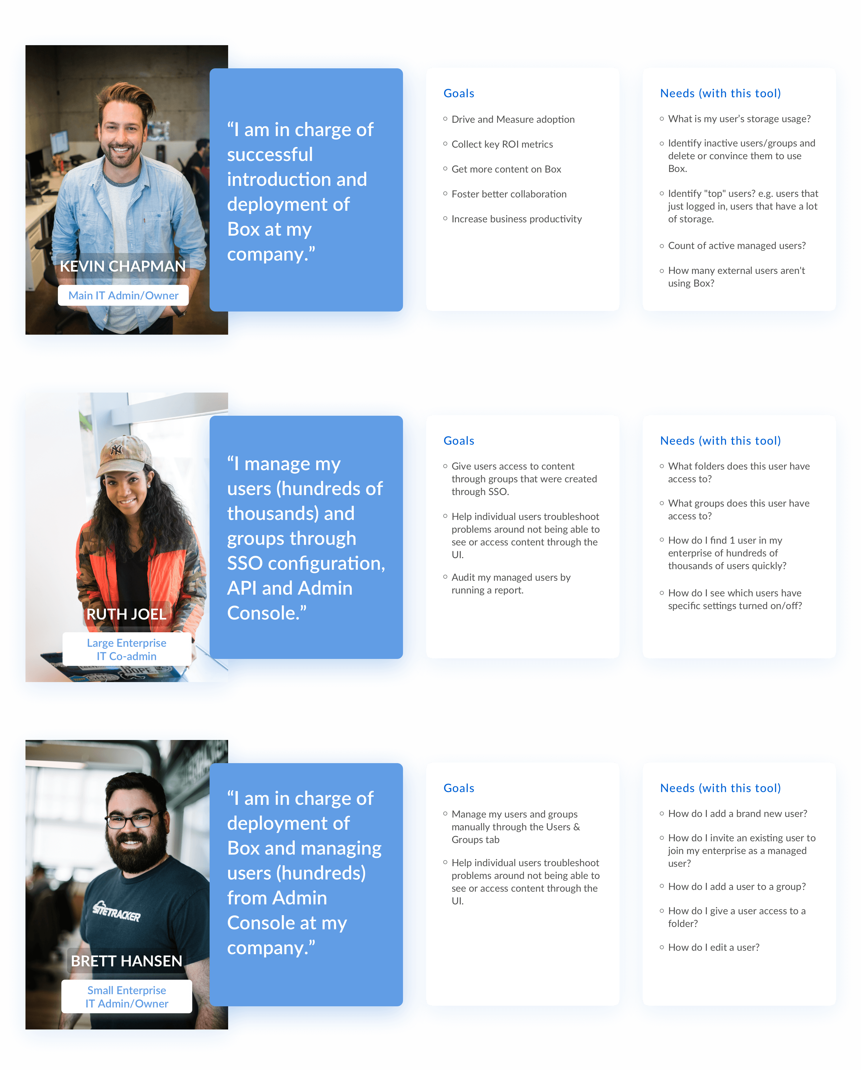
The Box Admin has 5 key personas we design for — IT Admin, Legal, Security Admin, Group Admin, and Helpdesk agent. The User Management tool is used primarily by one: the IT Admin.
Talking to IT Admins for this project, I identified 3 sub-personas with distinct, specific goals and needs.
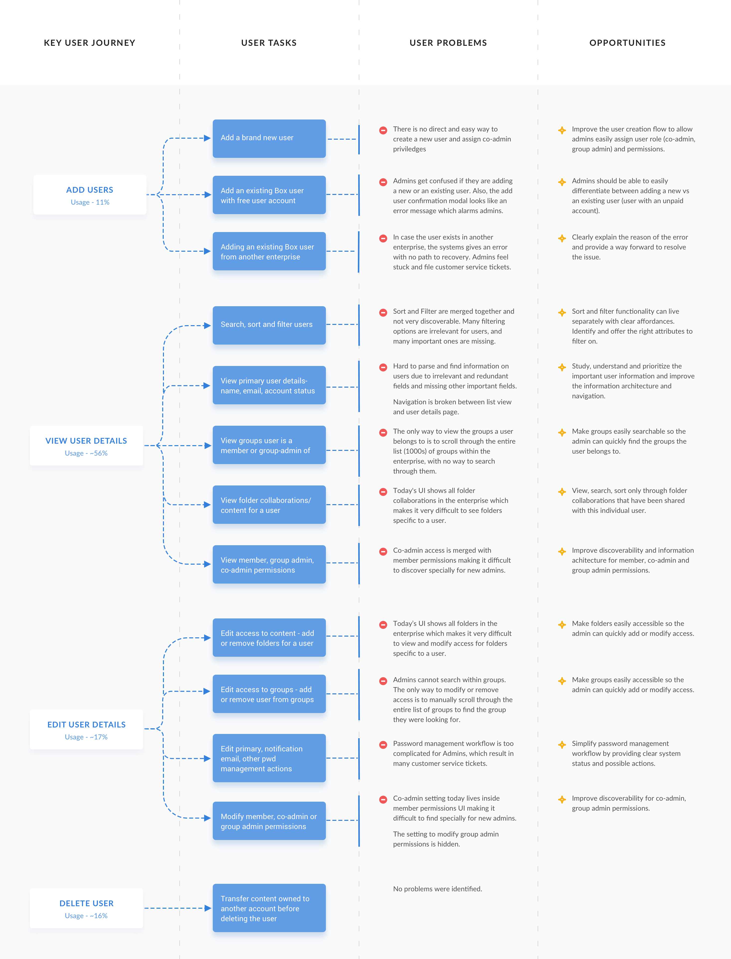
Defining user journeys
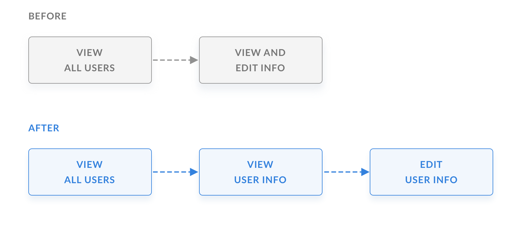
Establishing the interaction model
In the existing experience, admins viewed and edited information on the same page. But the data told a clearer story: admins were viewing 60% of the time and editing only 20%.
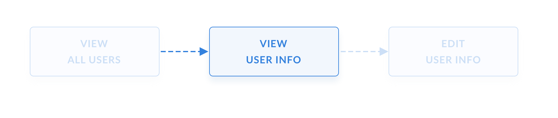
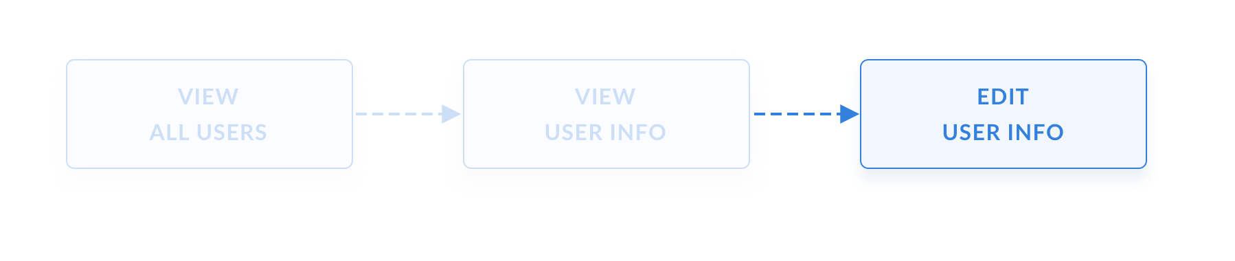
Using that insight, I split the experience into two distinct modes — View and Edit.
View — A cleaner UI where admins can scan information without being overloaded by functionality — and without worrying about accidentally updating a user's settings.
Edit — A dedicated mode for the times admins actually need to update information, with focused, contextual controls.
View all users
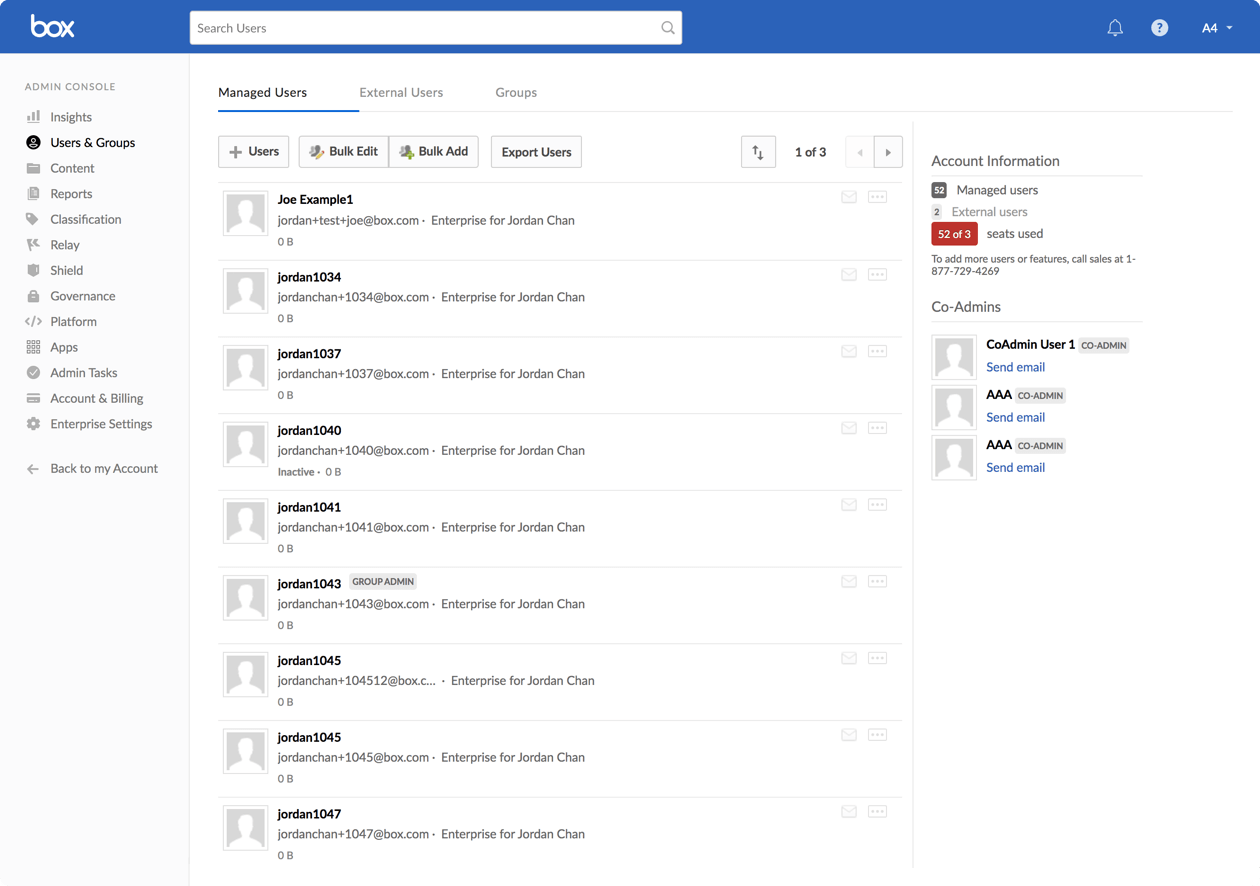
Before — The stacked view of info was not easily scannable, and information hard to parse. Some important information that admins would like was missing. Other attributes were either not useful or misleading.
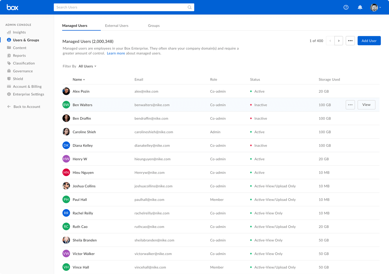
After — In the new dashboard, I updated the UI using Box design system and patterns. Reprioritized the attributes to be shown based on user input and usage analytics.
Filter & sort users
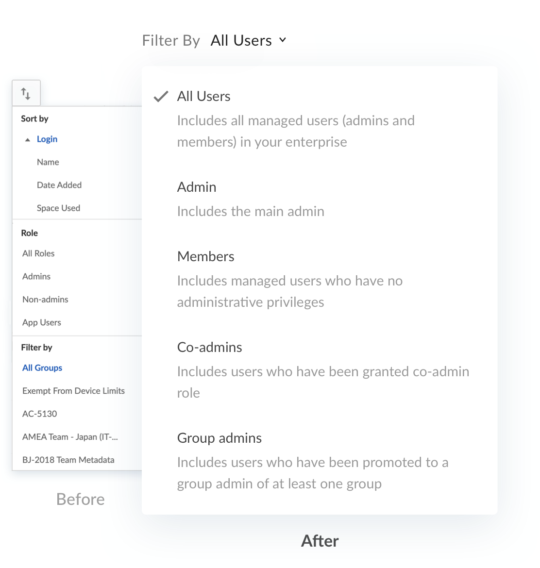
Sort and filter were the least discoverable and most problematic feature in the study — jumbled together, with a "Filter by groups" section that listed every group in the enterprise (often thousands), rendering it unusable. I:
- Offered sorting via table headers — a familiar, discoverable pattern.
- Removed "filter by groups" — admins looking for a group's users use the dedicated Groups tab, which has more robust functionality.
- Cut the excess to greatly simplify what remained.
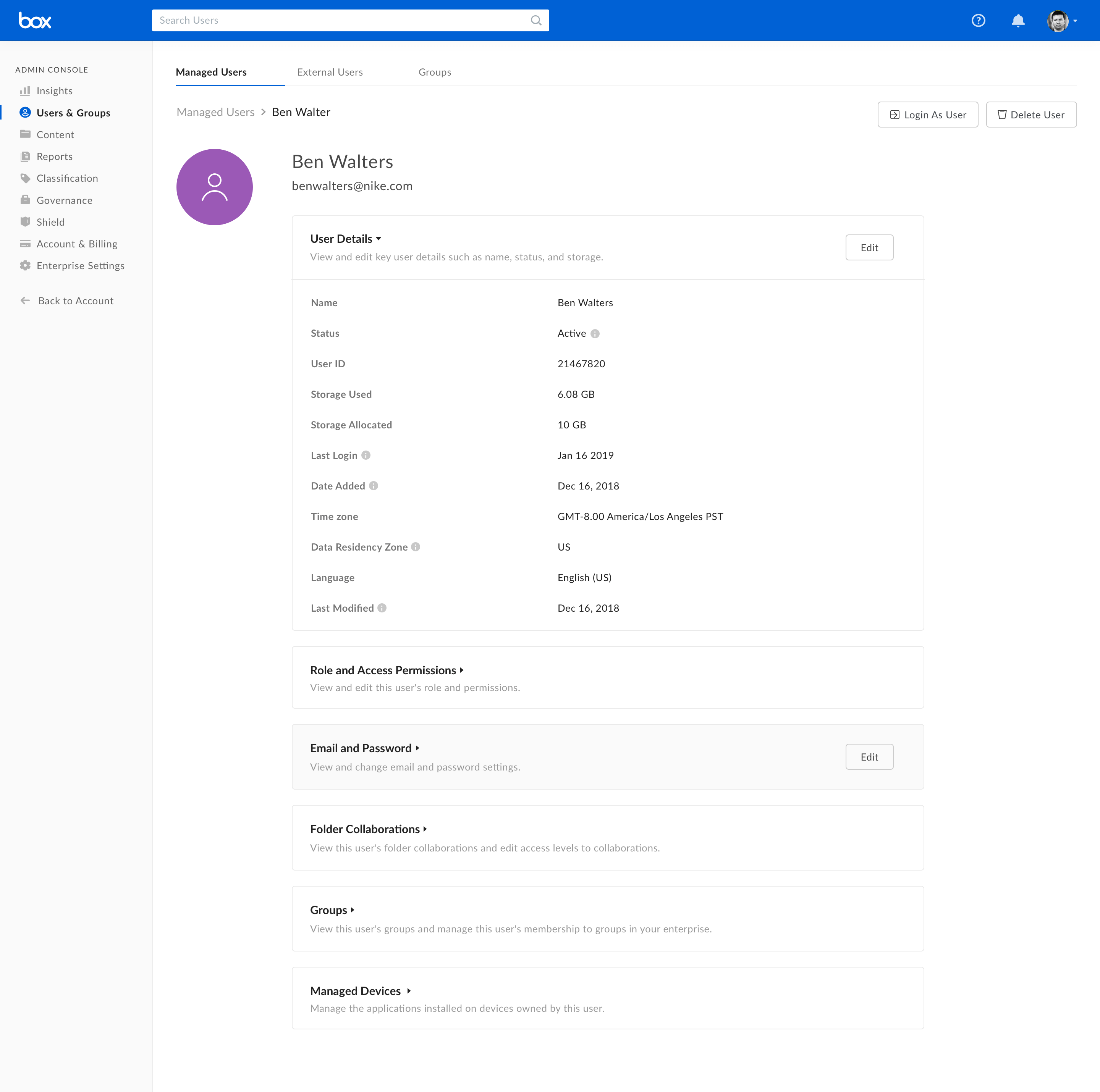
View user info
Before: admins faced one long page — a giant wall of information, permissions, and settings — that was hard to scan and heavy on cognitive load.
After: Information and permissions are chunked into card modules that expand and collapse on demand — easier to parse, with far less scrolling.
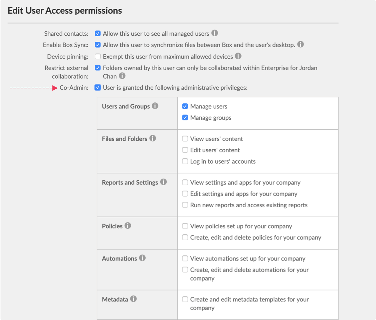
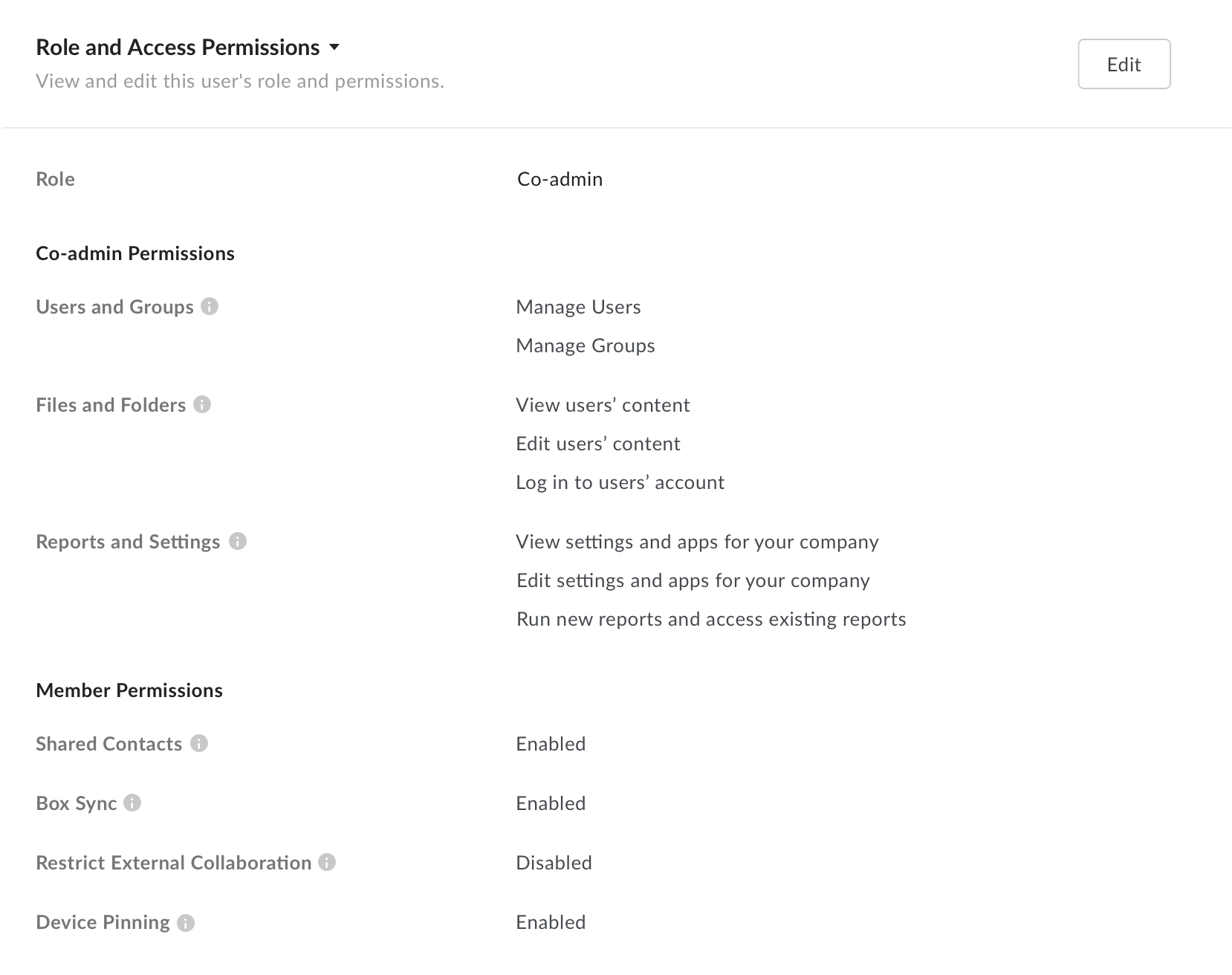
View role & access permissions
Before: the critical co-admin setting was buried, bunched together with member settings, and hardly visible.
After: a dedicated attribute highlights the user's role — member, co-admin, or admin — and permissions sit under separate headers so co-admin and member permissions are easy to tell apart.
Edit user info
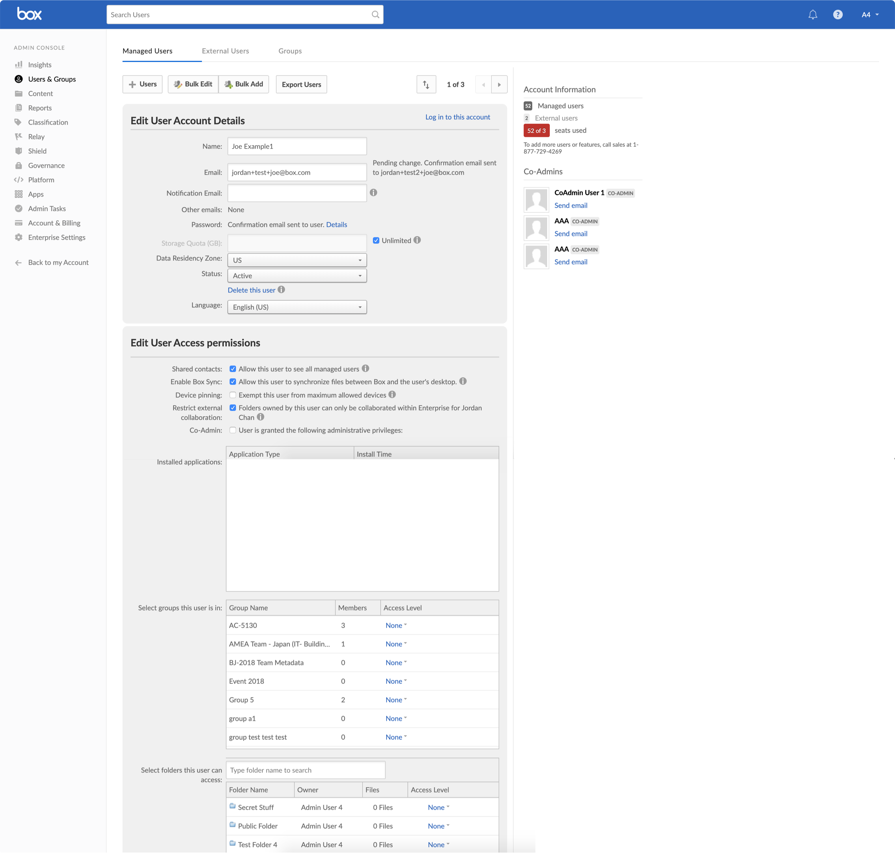
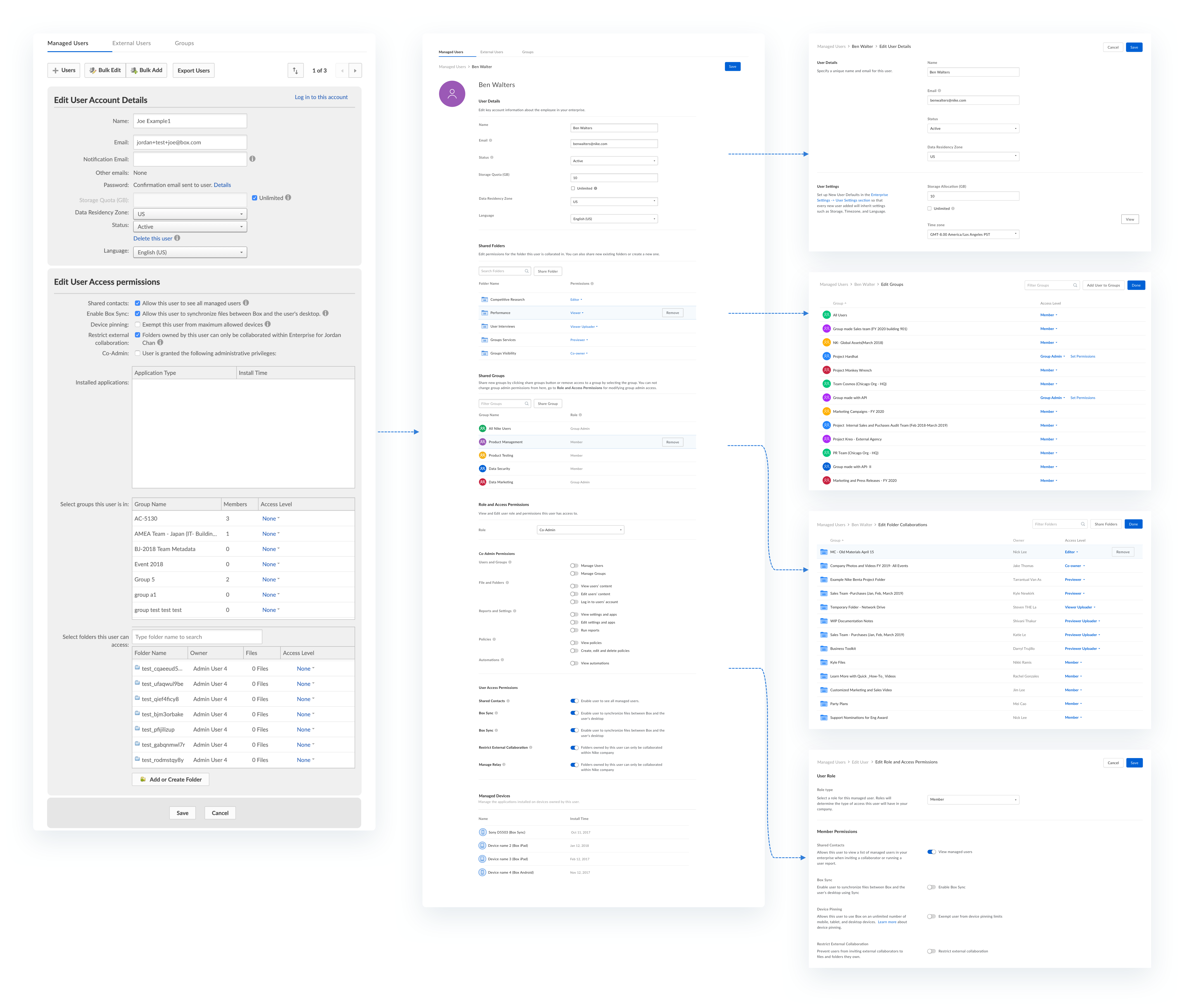
In the old UI, view and edit actions were conflated on the same page — user details were interspersed with edit controls, making information hard to scan and raising the odds of accidental changes.
Before— In the UI today, view and edit actions are conflated together on the same page. This made it really hard to scan information as all user details were interspersed with edit actions. This also increased chances of accidentally updating information.
V1— With a goal of focussed attention, I created two separate modes– View and Edit. In the first iteration, the Edit mode was a singular page where the Admin could edit any user setting or details.
Final design— Testing V1 in user interviews, I learnt that all the settings in one page felt like an overload of information. Admins usually update one or two pieces of information for a user and don't always need to see everything together. I used this insight to create separate edit flows for different user journeys. This design decision was helpful in 2 ways–
1. Since the user only saw a few related settings at once, I could provide more context about what each setting meant.
2. Decreased overall eng complexity.
Measuring success
Because the redesign shipped on a shifting timeline, I defined success up front around three measurable outcomes:
Page load < 5s
The managed-users page should load in under 5 seconds for every enterprise — small or large — making the page responsive and seamless.
More key actions
Better usability should increase the number of meaningful actions admins take after the redesign — and usage of key actions must not decrease.
Fewer tickets
Improved in-product guidance and usability should cut the volume of user-management support tickets the customer-success team receives.
Outcome & learnings
This was a major ground-up redesign — a lot of research, usability testing, and UX compromises throughout. As much as I'd have liked it to launch on time, shifting priorities and engineering-resource constraints pushed the timeline to an April launch.
1When more clicks is a good thing
Splitting View and Edit into separate modes meant more clicks for admins. But the added steps made them more confident, because they fully understood what each permission and setting meant before changing it.
Lesson: admins don't change settings every day, and given how critical these actions are, the goal was to help them make the right decision — not necessarily the fastest one.
2Prioritizing what to fix first
We had to rebuild the entire tool, backend and frontend, and we'd uncovered a long list of pain points and new feature ideas from research and logs.
Lesson: go broad to learn everything, then prioritize the most impactful areas to focus on first — you can't (and shouldn't) fix it all at once.